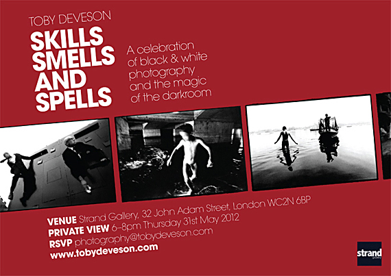
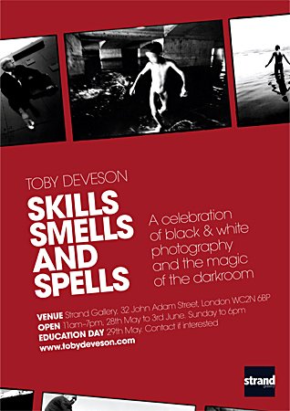
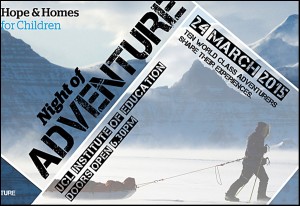
Designing the posters and invitations
Jim Shannon strikes again
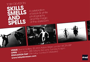
One of the unexpected highlights of putting the exhibition together was working with Jim (again) on the design of the posters and invitations.
I knew I didn’t have the budget to place much emphasis on anything other than the prints, frames and venue, so I approached the morning’s design session, rightly or wrongly, with little or no expectation. It pained me, but I knew that if I set my heart on coming up with something I was 100% happy with I would end up trying Jim’s patience, good will and available time.
As usual with these things we spent a few hours playing with basic designs and layouts, finding our feet and a common ground. Perhaps my mood and low expectations influenced us, but somehow things didn’t seem to click. I had no vision or ideal for us to pursue and didn’t want to place a burden of importance on the job or any expectations on Jim.
We muddled around trying to generate enthusiasm for perfectly adequate designs that would do the job, both of us knowing we would not be happy should they go to print…
Cue a quick break – the ever present (green) tea with generic snacks.
Followed by the decision to go back upstairs and choose – almost at random – one of the morning’s designs.
Then, as in all good books and films, that eureka moment.
I was looking down at the floor, scanning print outs of mediocre posters, head in hands. Jim, I assume free of the restrictions of my mood of pessimism, and safe in the knowledge that the job was done bar the choosing, drew on his years of experience as a designer and allowed his talent a free rein.
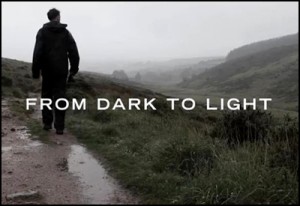
I looked up as he said something along the lines of ‘we could try this’ or ‘do that’ or ‘what about’ and sat back and smiled. Almost with a flourish he produced the basic design for something that became the essence of the exhibition. A voice for the show that I used with pride and enthusiasm, knowing it was eye catching, simple, effective and, most importantly, representative of my work and what I was trying to say.
To say that half an hour later it was done would take away from the subsequent work Jim put into it – tweaking the text, moving the images up or down a few mm and producing a portrait version – but, looking back that is what it felt like.
Let’s just say, it flowed – it became and it felt as if it had always existed.
Related Images